1 min readUpdated  TuneSera
On this page
Fine-tune how much space your directory uses, the shape of station cards, and the style of play buttons.
Pro feature. This feature needs TuneSera Pro with an active license. Get TuneSera Pro
Spacing & shape#
Go to TuneSera → Settings → Design → Spacing & shape.
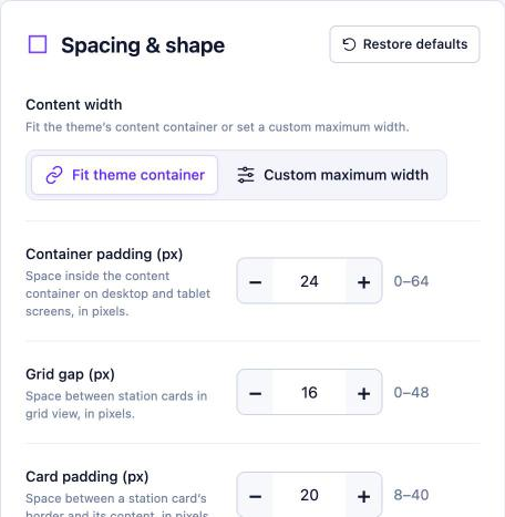
| Setting | What it does |
|---|---|
| Content width | Fit theme container matches your theme’s content width. Custom maximum width lets you set your own. |
| Container padding (px) | Space inside the content area on desktop and tablet (0–64). |
| Mobile padding (px) | Space inside the content area on phones. |
| Grid gap (px) | Space between cards in grid view (0–48). |
| Card padding (px) | Space inside each card (8–40). |
| Card corner radius (px) | Rounded corners. Use 0 for square cards (0–32). |
| Card border width (px) | Card border thickness. Use 0 to remove borders (0–3). |
| Card shadow | None, Soft or Raised. |
Buttons#
Go to TuneSera → Settings → Design → Buttons.
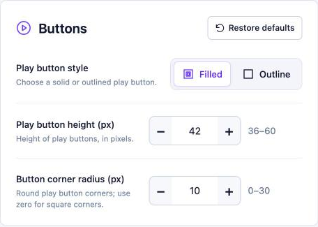
- Play button style: Filled or Outline.
- Play button height (px): 36–60.
- Button corner radius (px): 0 for square, up to 30 for fully rounded.
Use the Live preview to check every change, then click Save changes. Restore defaults resets the current section.
Related articles#
Was this article helpful?