
A radio directory is something people scan quickly: find a station, press play, move on. Good design makes that effortless and makes your site feel trustworthy. This guide walks through radio directory design in TuneSera, from layouts and station cards to colors, typography and spacing, with practical tips for each.
Design principles for radio directories
- Scannable beats decorative. Visitors are hunting for a station name or logo.
- The play button is the main action. Make it obvious on every card.
- Less detail per card means more stations visible at once.
- Mobile first. Most radio listening happens on phones.
TuneSera’s settings all have a Live preview with Desktop, Tablet and Mobile views, so you can check each change before you save.
Choose a layout: list or grid
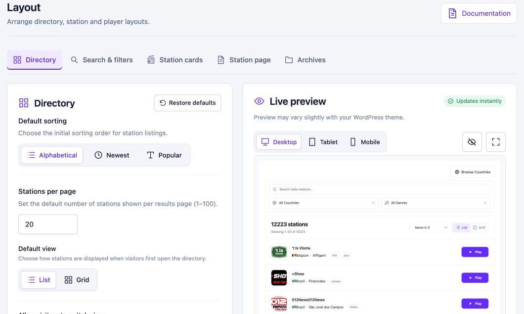
Go to TuneSera → Settings → Layout → Directory and choose a Default view:
- List shows a clean row per station with more room for details. It’s tidier when many stations have no logo.
- Grid shows stations as cards side by side. It looks great when most stations have good logos.
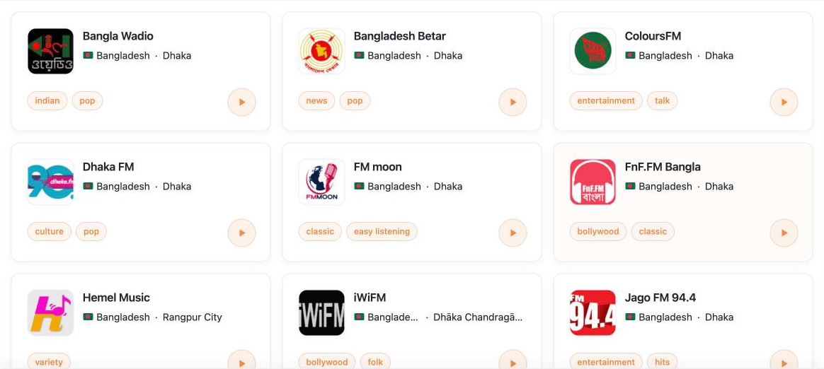
Turn on Allow visitors to switch views to let people choose, and set grid columns separately for desktop, tablet and mobile. You can also add a country, division, city or genre sidebar beside the stations, on the left or right.
Customize station cards
In Layout → Station cards, choose what each card shows: logo (with size and shape), description and how many lines it can use, genres, location, language, frequency, and where the play button sits. These settings apply everywhere cards appear, including archives and shortcodes.

Tip: logo, name, location and genres are usually enough. Add descriptions only if most of your stations have good ones.
Match your brand with colors
Go to Settings → Design → Colors and pick a preset (Default, Ocean, Forest or Sunset) or set each color yourself: accent, background, card, text, secondary text, border, button text and hover.
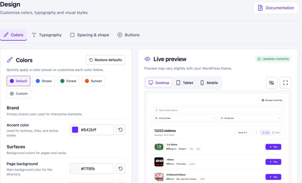
Check contrast as you go. A light accent color needs dark button text, and vice versa. Readable text matters more than an exact brand match.
Pro: typography, spacing and buttons
TuneSera Pro adds finer control for brand-perfect sites:
- Typography: font family, body, heading and title sizes, title weight and line height. Inherit from theme is usually the best choice for consistency.
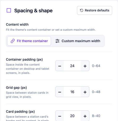
- Spacing & shape: content width, padding, grid gap, card padding, corner radius, border and shadow.
- Buttons: filled or outline play buttons, play button height (36–60 px) and button corner radius from square to fully rounded.
Design your station pages
In Layout → Station page, choose which sections appear: breadcrumbs, description, genre links, location and broadcast information, contact information, social links, Wikipedia link and related stations. Empty sections hide themselves automatically.
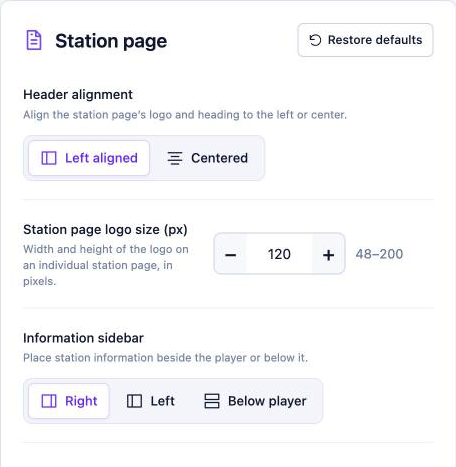
Pro adds layout options: header alignment, logo size (48–200 px), information sidebar position, the number of related stations, and putting contact details first. That’s handy if your site is about a single station or network.
Don’t forget the player
The sticky player is part of your design too. Choose which controls appear, and with Pro, pick a player style. See How to Add a Live Radio Player to Your WordPress Site for every option.
Quick design checklist
- Default view chosen to suit your logos
- Columns checked on desktop, tablet and mobile
- Cards trimmed to the essentials
- Colors with readable contrast
- Station pages showing the sections your visitors need
- Unneeded filters hidden for a cleaner page
Frequently asked questions
Will TuneSera match my theme?
TuneSera works with any well-built theme, and your theme also styles the page around the directory. Use colors, and Pro typography set to inherit from your theme, for the closest match.
Can I reset my design changes?
Yes. Each section has Restore defaults, and individual colors have their own reset button.

Join the conversation